Biteable Digital
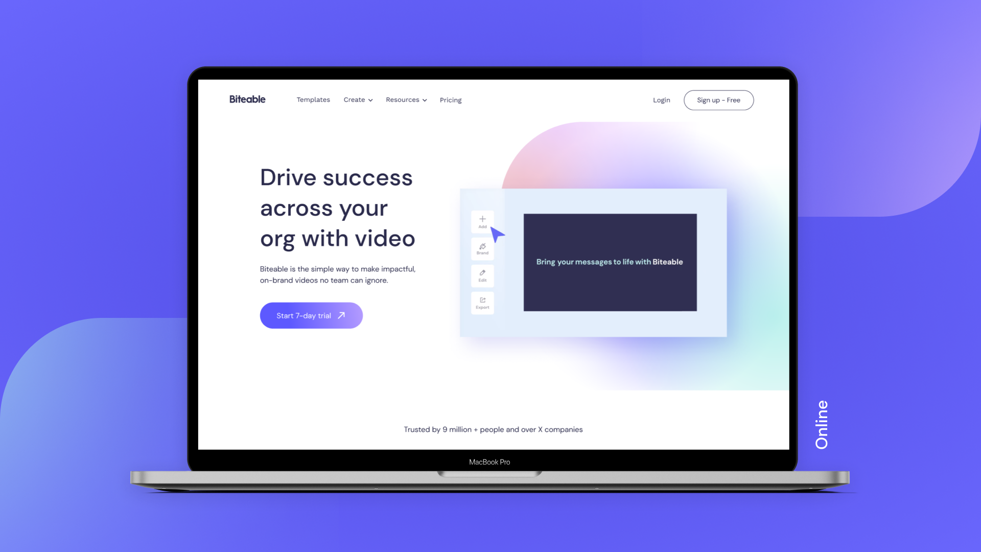
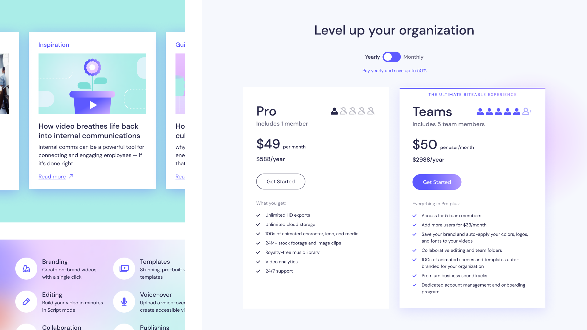
Being an online video editing tool, Biteable needs a strong digital presence. As part of the rebrand project, we created a new website, as well as a new visual language to promote the platform. Below you can see three areas of focus: website, features promotion (including animations), and digital communications. To see it all in action, you can visit the website here.
Website
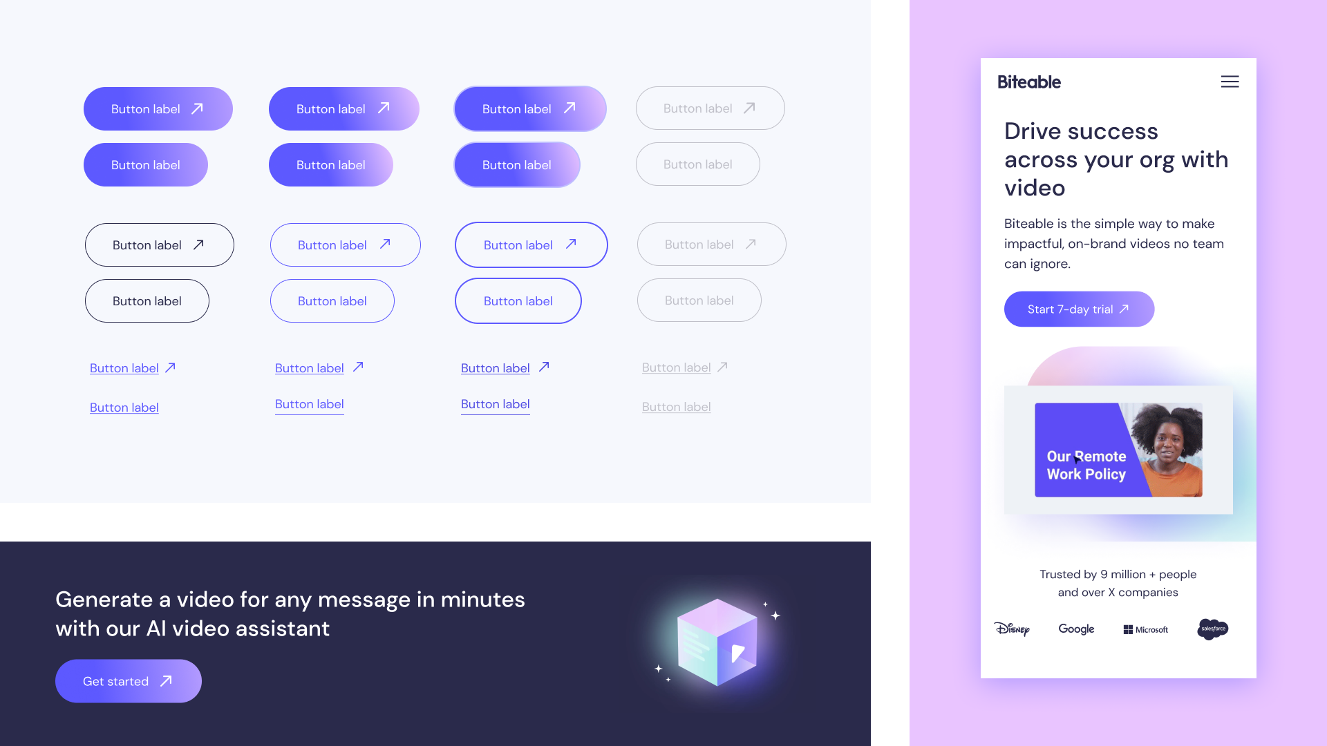
To do a complete overhaul of the website, we started with concepts on Figma. Once these were approved by the stakeholders, I’ve built a full library of UI components, from buttons to headers. We used Elementor to build the website, creating templates for all the components and their variations, which speeds up the page creation process and guarantees consistency throughout.


Features
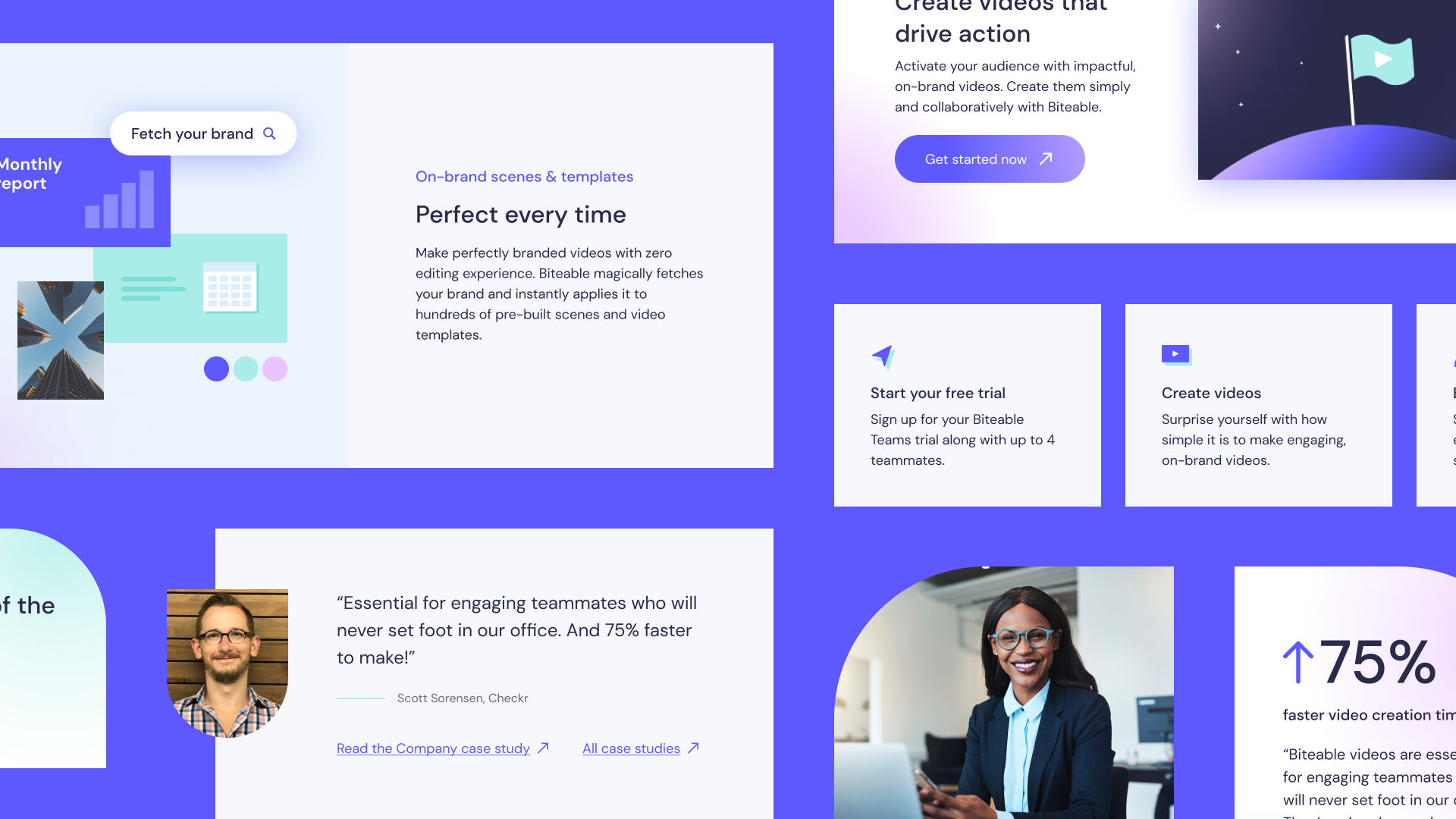
One of the most important aspects of promoting an online tool is presenting its features. On both static and animated assets, I’ve simplified the interface to convey what the tool does in a fast and simple way. Working with the animation team, I’ve developed storyboards and keyframes for promotional assets that showcase the video editor, some of which you can see below.

Storyboard on the left, final explainer video above.
Some of the feature highlights: branding, script editing and collaboration.


Static feature asset examples: animation, record, analytics, sharing
Digital Communications
As well as the website and feature promotion, Biteable communicates with its audience through emails, social media and in-app notifications, as well as advertising in places such as Google Ads. Here are some materials I have developed (both templates and individual assets) to promote the company and its product.

Gamifying the trial journey: icons and progress bar


Examples of ads


Podcast episode cover and logo
